FLUX.2 Dev, Flex, Pro, and Max: A Full Comparison Across Six Creative Themes
By None None
Published: April 16, 2026
10 min read
Tags: FLUX.2, AI image generation, Black Forest Labs, text-to-image, image comparison
Category: AI Tools & Models
Choosing the right AI image generation model is one of those decisions that looks simple until you're mid-project and realizing your outputs aren't landing the way you expected. Too many creators default to either the cheapest option or the most expensive one, without stopping to understand what the gap between them actually looks like in practice.
FLUX.2, developed by Black Forest Labs, is built around the idea that different stages of the creative process need different tools. Four key models in the lineup — Dev, Flex, Pro, and Max — represent genuinely different trade-offs, and that's where the real decisions happen. They represent genuinely different trade-offs between cost, control, and output quality. Knowing which one to use, and when, is the difference between a workflow that scales and one that generates unexpected costs with unpredictable results.
To give you a concrete, visual answer to that question, I ran all four FLUX.2 models through six text-to-image themes and two image-to-image scenarios using AI Compare Hub's multi-model workspace. Every result you see here was generated on the same prompt, in the same session, so the differences are entirely down to the models themselves.
What Is FLUX.2?
FLUX.2 is a family of text-to-image and image-to-image generation models from Black Forest Labs that builds on the original Flux architecture — widely recognized for its strong prompt adherence and photorealistic output quality. While the original lineup required creators to figure out the right model by trial and error, FLUX.2 makes those trade-offs explicit from the start.
The FLUX.2 family spans more than four models, but for this comparison we focused on four that cover the full range of creative trade-offs in the lineup. FLUX.2 Dev is the open-weights entry point, designed for low-cost ideation and rapid exploration. FLUX.2 Flex exposes step-count and guidance controls so you can dial the speed-versus-quality trade-off yourself, and supports multi-image reference blending for composed shots. FLUX.2 Pro occupies the reliable production middle ground, balancing output quality with cost for sustained generative work. FLUX.2 Max delivers the highest fidelity and detail for outputs where quality is non-negotiable.
The table below summarizes the key parameters before we get into the visual comparisons.
| Parameter | FLUX.2 Dev | FLUX.2 Flex | FLUX.2 Pro | FLUX.2 Max |
| Safety tolerance (1–5) | – | ✓ | ✓ | ✓ |
| Output format | ✓ | ✓ | ✓ | ✓ |
| Output quality | ✓ | ✓ | ✓ | ✓ |
| Image input (I2I) | ✓ | ✓ | ✓ | ✓ |
| Multi-reference images | up to 10 | up to 10 | up to 8 | up to 8 |
| Inference steps | ✓ | ✓ (1–50) | – | – |
| Guidance scale | ✓ | ✓ (1.5–10) | – | – |
| Prompt upsampling | – | ✓ | – | – |
Pricing varies by model and is calculated from input/output image megapixels, with some models including a flat per-run fee. The table below shows reference costs:
| Model | API Pricing Example |
| FLUX.2 Dev | $0.024 |
| FLUX.2 Flex | $0.120 |
| FLUX.2 Pro | $0.060 |
| FLUX.2 Max | $0.100 |
Estimated cost for a 1 MP (1024 × 1024 px) input and output via the Replicate API. Actual pricing depends on resolution and usage volume.
How AI Compare Hub’s Text-to-Image Workspace Works
AI Compare Hub’s Text-to-Image workspace lets you run up to four models simultaneously on the same prompt. Instead of switching tabs and comparing outputs from memory, you get every model’s response in a single side-by-side view, generated at the same moment.
To use it: navigate to the workspace, select your models in the Model Selection panel, type your prompt once, and click Generate. All active models process the same input simultaneously and the results appear in a four-slot grid. Each image can be downloaded independently, and you can swap models in or out at any time without clearing your prompt.
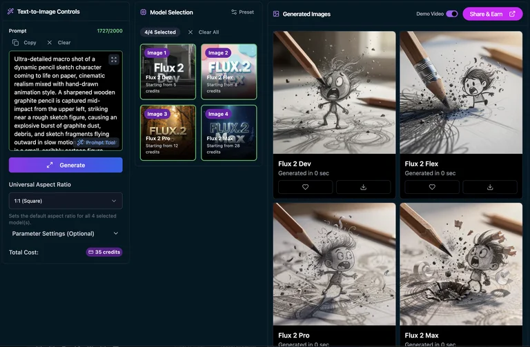
AI Compare Hub’s Text-to-Image workspace — all four FLUX.2 models selected simultaneously
Dev, Flex, Pro, and Max running the same prompt in a single session
This is exactly how I generated all six T2I comparison sets below — one prompt, one session, all four models running at the same time.
Text-to-Image Comparison: Six Creative Themes
Each theme below tests a different dimension of model capability — from atmospheric interior rendering and fine historical detail to fashion editorial work, anime illustration, and typography-heavy scenes. The same prompt went to all four models. The differences in output are purely down to each model’s architecture and quality tier.
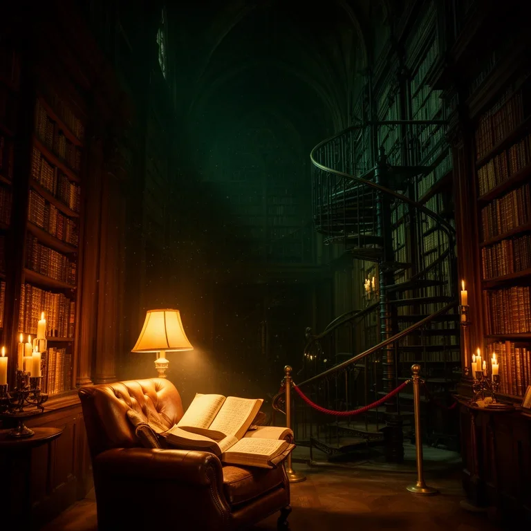
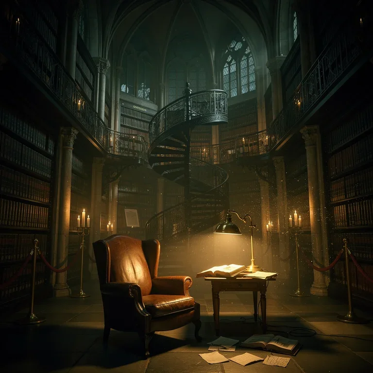
Theme 1: Dark Academia Library
Prompt: a grand dark academia library at dusk, towering mahogany bookshelves, warm amber candlelight, leather-bound tomes, gothic arched windows casting long shadows, atmospheric dust motes in the light, rich jewel-toned colors, cinematic depth
A dark academia library is a demanding atmospheric scene. It demands convincing candlelight against a dark interior, realistic depth across rows of bookshelves, and fine textural detail in leather-bound books and gothic architectural elements — exactly the kind of scene where tier differences show up immediately in the warmth and volume of the lighting.
 FLUX.2 Dev | 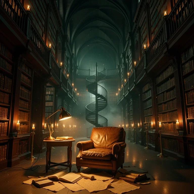 FLUX.2 Flex |
 FLUX.2 Pro | 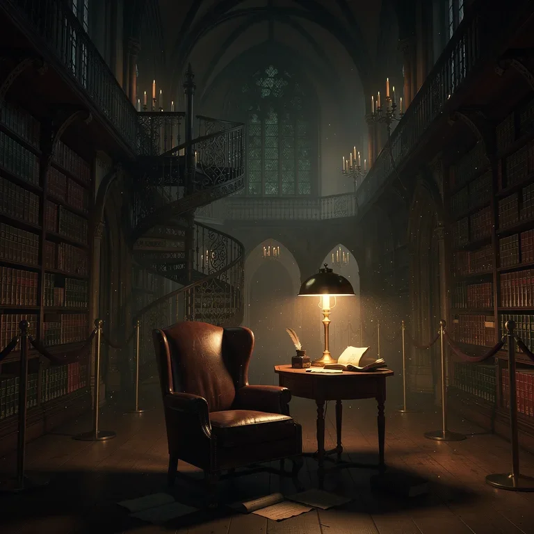 FLUX.2 Max |
FLUX.2 Dev: Layout and candlelight are readable but the shelves stay flat — amber light sits on top of the scene rather than radiating through it. Usable as a compositional draft, not as a final.
FLUX.2 Flex: Higher contrast gives the candles more punch and deeper shadow pockets. Reads editorial rather than naturalistic — a fit when mood outweighs photographic accuracy.
FLUX.2 Pro: Candlelight behaves like an actual source, with fall-off visible across the shelves. Foreground book spines show individual detail. Ready for production at standard viewing sizes.
FLUX.2 Max: Volumetric candle cones, physically convincing light fall-off, and legible spine lettering in the foreground. Gothic arches at the edges add structural depth. Print-grade output.
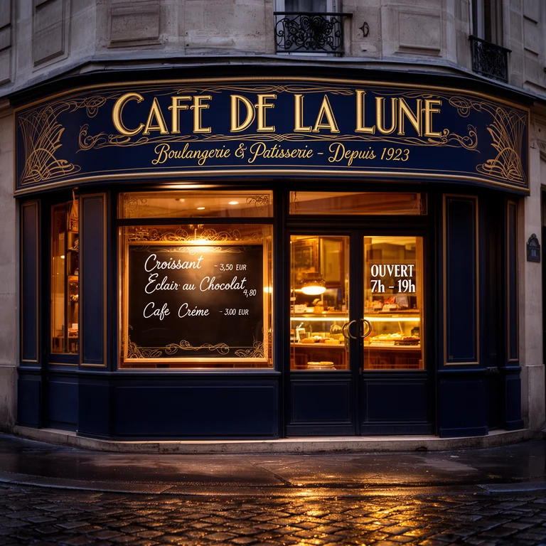
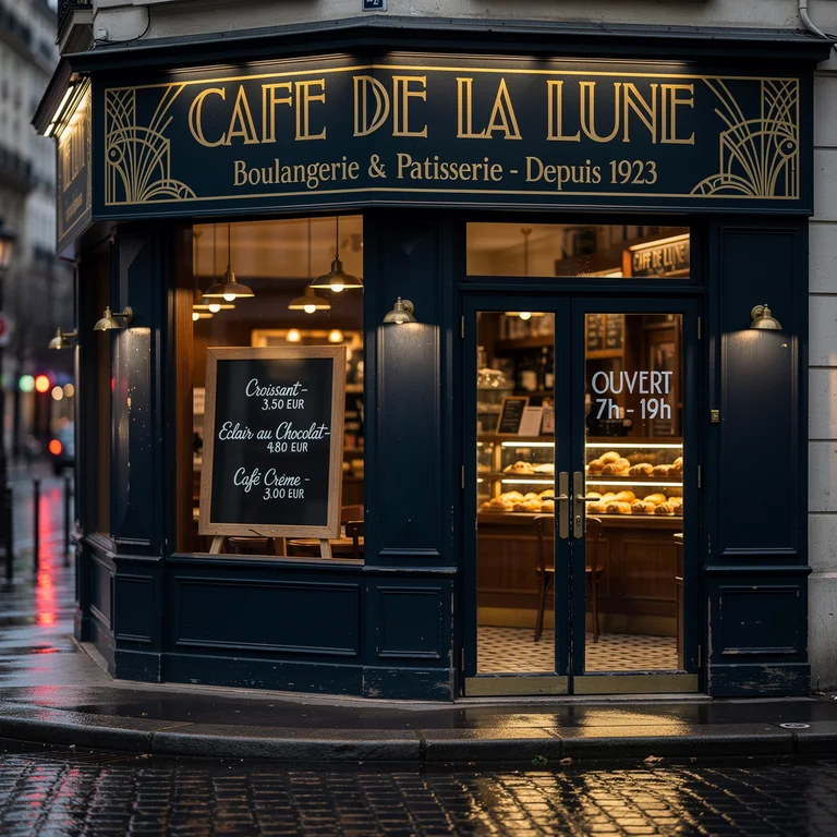
Theme 2: Parisian Café Storefront (Text Rendering Test)
Prompt: a charming 1920s Parisian corner café storefront at twilight, an ornate hand-painted gold-on-navy sign across the top reading “CAFÉ DE LA LUNE” in elegant Art Deco typography, a smaller subtitle underneath reading “Boulangerie & Pâtisserie — Depuis 1923”, a chalkboard in the front window listing “Croissant — €3.50”, “Éclair au Chocolat — €4.80”, “Café Crème — €3.00” in neat handwritten cursive, a vinyl decal on the glass door reading “OUVERT 7h — 19h”, warm glowing interior light, wet cobblestones reflecting the signage, photorealistic, ultra-detailed typography
Text is the most unforgiving test for a generative image model. A storefront at twilight compounds the challenge: it demands multiple text blocks at different scales, different typographic styles (Art Deco display, sans-serif subtitle, cursive chalkboard, utilitarian decal), French diacritics (é, è, â), currency symbols, and correct numerical pricing — all rendered crisply enough to be legible. This prompt deliberately sets a high bar: a model either gets the typography right, or it produces a scene that looks correct at a glance and falls apart the moment a reader looks at the sign.
 FLUX.2 Dev | 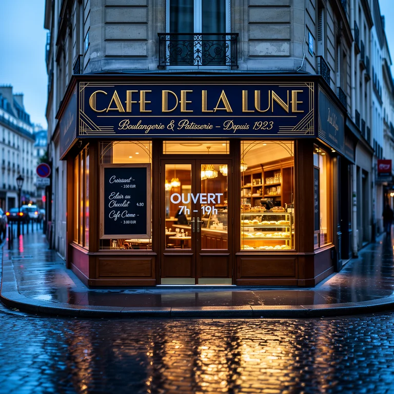 FLUX.2 Flex |
 FLUX.2 Pro | 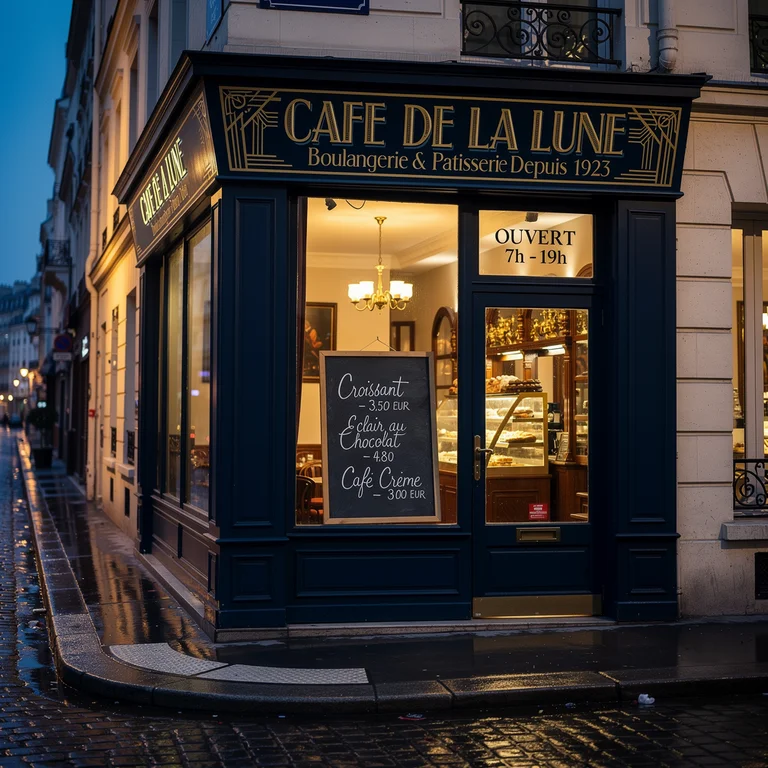 FLUX.2 Max |
FLUX.2 Dev: Main sign drops its diacritic and renders as “CAFE DE LA LUNE.” The subtitle is present but shrunken. The chalkboard is cursive-shaped but effectively illegible on close inspection — items and prices read as decorative squiggles rather than words. Atmospheric lighting and wet-cobblestone reflections are convincing; the typography is the weak link.
FLUX.2 Flex: Main “CAFÉ DE LA LUNE” sign renders with the É diacritic intact and reads cleanly. The subtitle is still legible at normal viewing distance. The chalkboard collapses into cursive noise on close inspection — individual menu items cannot be parsed. The OUVERT text appears but is placed on the door itself rather than rendered as the small vinyl decal the prompt specifies — placement intent is misread. Fine for social thumbnails; not for anywhere the menu or signage needs to be accurate.
FLUX.2 Pro: Main sign renders sharply with clean Art Deco ornamentation in the corners. The subtitle is readable but drops the circumflex in “Pâtisserie” (shows as “Patisserie”). Chalkboard items — Croissant, Éclair au Chocolat, Café Crème — are identifiable on close inspection, though the prices are softer. The OUVERT 7h–19h decal reads correctly. Solid for commercial work unless the camera is pushed tight on the menu.
FLUX.2 Max: Strongest text rendering of the four. The Art Deco display lettering is crisp, flanked by decorative side panels; the subtitle and OUVERT decal read cleanly; and the chalkboard menu items are the most legible in the comparison. A small spacing quirk around the em dash in the subtitle is the only visible flaw. Good enough for web and social out of the box, and close to usable for print with light retouching.
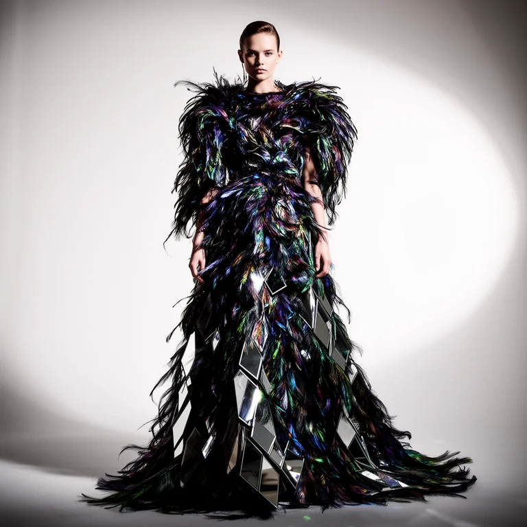
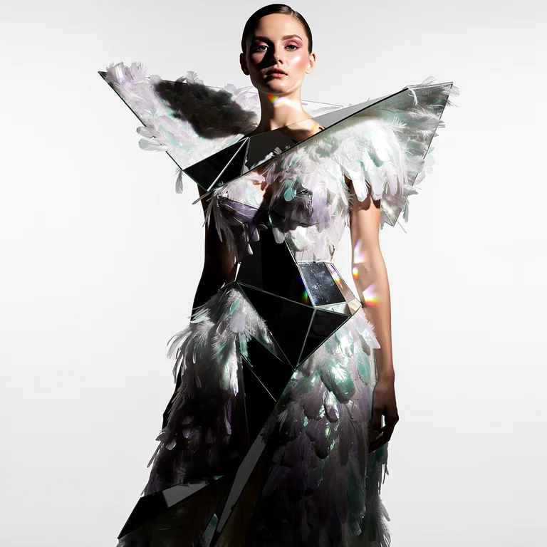
Theme 3: Haute Couture Portrait
Prompt: a haute couture fashion portrait of a young woman in an elaborate jeweled silk ballgown, couture headdress with feathers and crystals, professional studio lighting with dramatic shadows, fashion magazine editorial aesthetic, ultra-detailed fabric and embroidery, isolated dark background
A haute couture portrait demands precise rendering of complex fabric structures, crystal and feather embellishment, and professional studio lighting — all while maintaining facial likeness at close inspection. It separates models capable of fine material simulation from those working at the level of suggestion.
 FLUX.2 Dev | 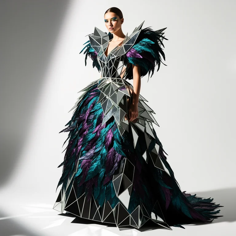 FLUX.2 Flex |
 FLUX.2 Pro | 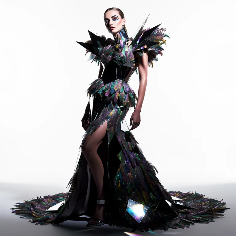 FLUX.2 Max |
FLUX.2 Dev: Correct silhouette and studio lighting, but the embroidery and crystals read as generalized texture rather than discrete elements. Good for confirming composition.
FLUX.2 Flex: Cleaner fabric layering and more defined feathers in the headdress. Crystals still generalized, but the editorial polish steps clearly above Dev.
FLUX.2 Pro: Silk shows credible fabric physics — weight and sheen respond to light. Feather strands have depth rather than flat silhouette. Holds up under close inspection.
FLUX.2 Max: Individual crystal facets with their own light interaction, strand-level feather definition, convincing drape, and clean specular highlights. Fashion-editorial final.
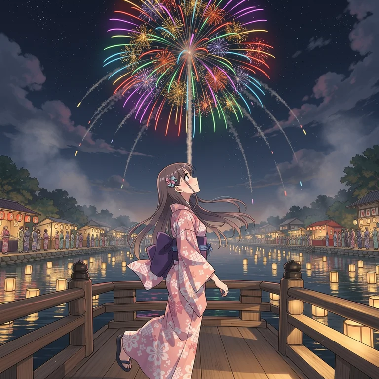
Theme 4: Anime Fireworks Festival
Prompt: a nostalgic summer festival anime scene, colorful fireworks bursting over a traditional Japanese town at night, yukata-clad crowd by the riverside, glowing paper lanterns, warm reflections on water, Makoto Shinkai inspired sky, rich saturated colors
A Makoto Shinkai–inspired summer festival tests anime-specific illustration quality: accurate cel-shading, saturated night-sky light from fireworks, crowd rendering, and the warm-nostalgic atmosphere that defines Japanese animation festival aesthetics. This is as much a style-fidelity test as a detail test.
 FLUX.2 Dev | 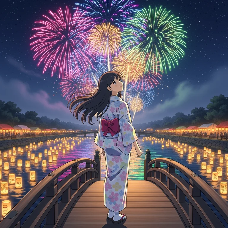 FLUX.2 Flex |
 FLUX.2 Pro | 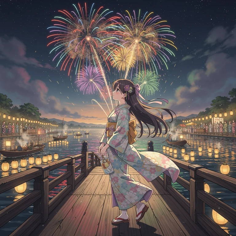 FLUX.2 Max |
FLUX.2 Dev: Festival mood and fireworks land, but cel-shading is simplified and the crowd and lanterns feel loosely attached to the scene.
FLUX.2 Flex: Stronger burst definition and brighter light scatter on the crowd and buildings. Flex’s contrast tendency suits a fireworks spectacle.
FLUX.2 Pro: Lantern glow interacts with nearby figures, water reflects the sky’s palette, and each firework has stem → burst → trail structure rather than uniform blooms.
FLUX.2 Max: Fully articulated sparks with color-accurate chemistry (white core, color fading outward), distinguishable yukata detail in the crowd, and water that carries the full sky composition. Shinkai-grade warmth.
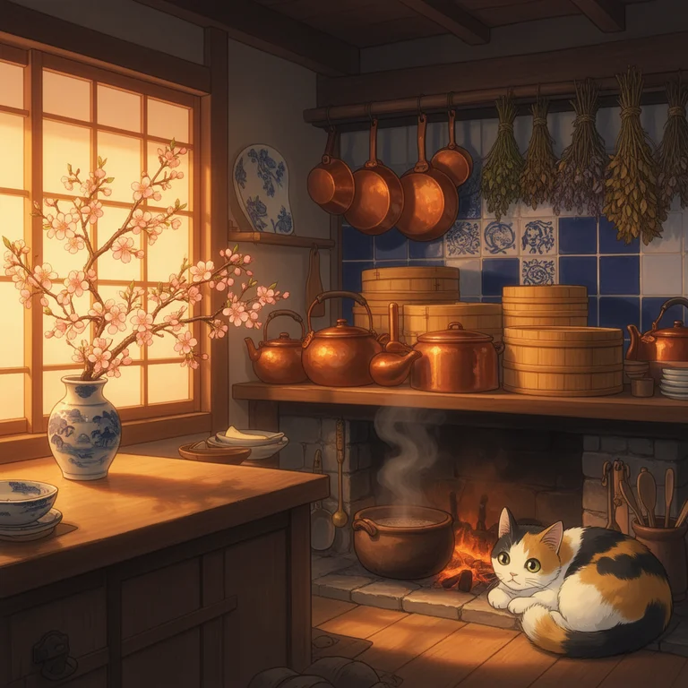
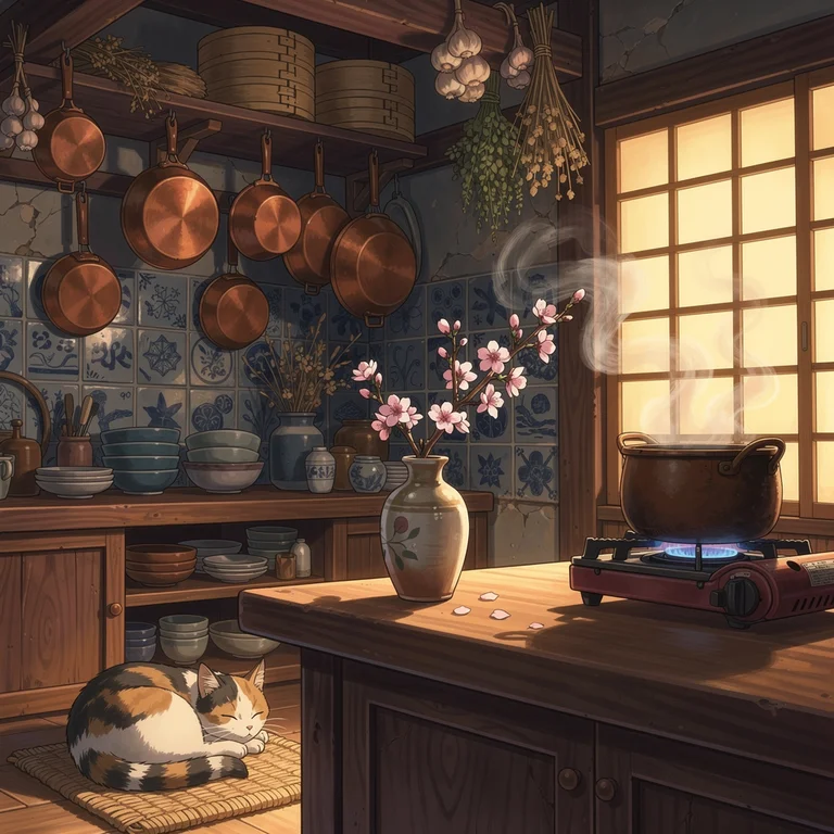
Theme 5: Anime Kitchen
Prompt: a beautiful young woman cooking in a warmly lit home kitchen, golden morning light through gauze curtains, soft anime illustration style, expressive large eyes, detailed facial features, cherry blossoms visible through the window, cozy domestic atmosphere, Studio Ghibli inspired
A Studio Ghibli–inspired kitchen portrait tests the softer, more grounded end of anime illustration — realistic domestic interior rendering, natural morning light quality, and expressive character design. The challenge is balancing lived-in warmth with the precise character rendering that anime-style illustration requires.
 FLUX.2 Dev |  FLUX.2 Flex |
 FLUX.2 Pro | 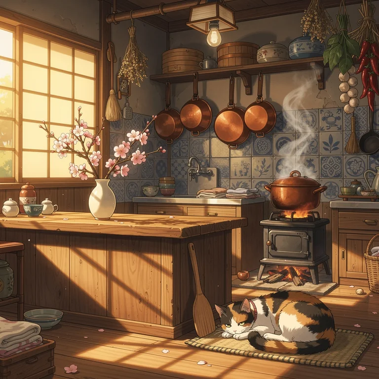 FLUX.2 Max |
FLUX.2 Dev: Correct composition and general Ghibli register, but the face lacks expressive specificity and environment details stay at the hint level.
FLUX.2 Flex: Face and kitchen both gain definition, morning warmth reads better, and the cherry blossoms outside are distinctly placed. Ghibli softness preserved.
FLUX.2 Pro: Quality-anime eyes with proper iris reflections, strand-level hair detail, and a fully integrated kitchen. Production baseline for anime character work.
FLUX.2 Max: Expressive eyes with clear iris detail and natural skin tones, consistent directional morning light, and fully integrated environment detail — curtains, blossoms, warm counters — all Ghibli-authentic.
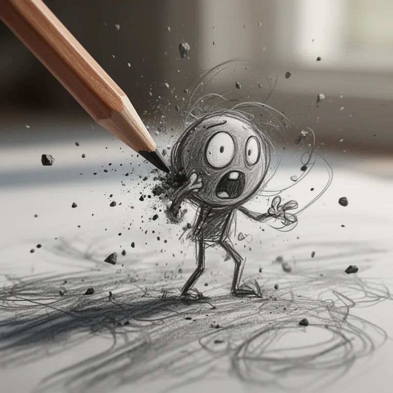
Theme 6: Pencil Sketch Character
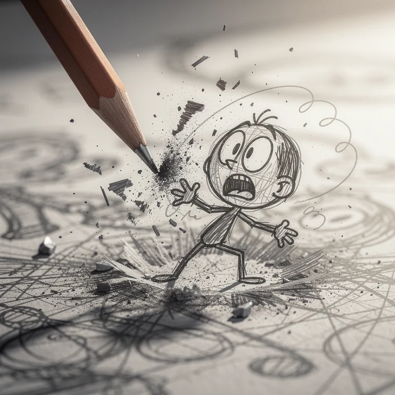
Prompt: Ultra-detailed macro shot of a dynamic pencil sketch character coming to life on paper, cinematic realism mixed with hand-drawn animation style. A sharpened wooden graphite pencil is captured mid-impact from the upper left, striking near a rough sketch figure, causing an explosive burst of graphite dust, debris, and sketch fragments flying outward in slow motion. The character is a small, scribbly cartoon figure drawn with messy, energetic pencil strokes—thin stick-like limbs, oversized round head, exaggerated oval eyes, and a wide open mouth expressing shock or panic. Shallow depth of field, soft natural daylight, motion blur on debris and pencil tip, ultra-high detail on graphite textures, paper grain, and sketch lines. Style blends photorealistic macro photography with expressive hand-drawn animation.
This prompt tests a model’s ability to blend photorealistic macro photography with stylized cartoon illustration — graphite particle physics, shallow depth of field rendering, paper grain micro-texture, and expressive cartoon linework, all at once. The tension between the hyper-real environment and the hand-drawn character is the central challenge.
 FLUX.2 Dev |  FLUX.2 Flex |
 FLUX.2 Pro | 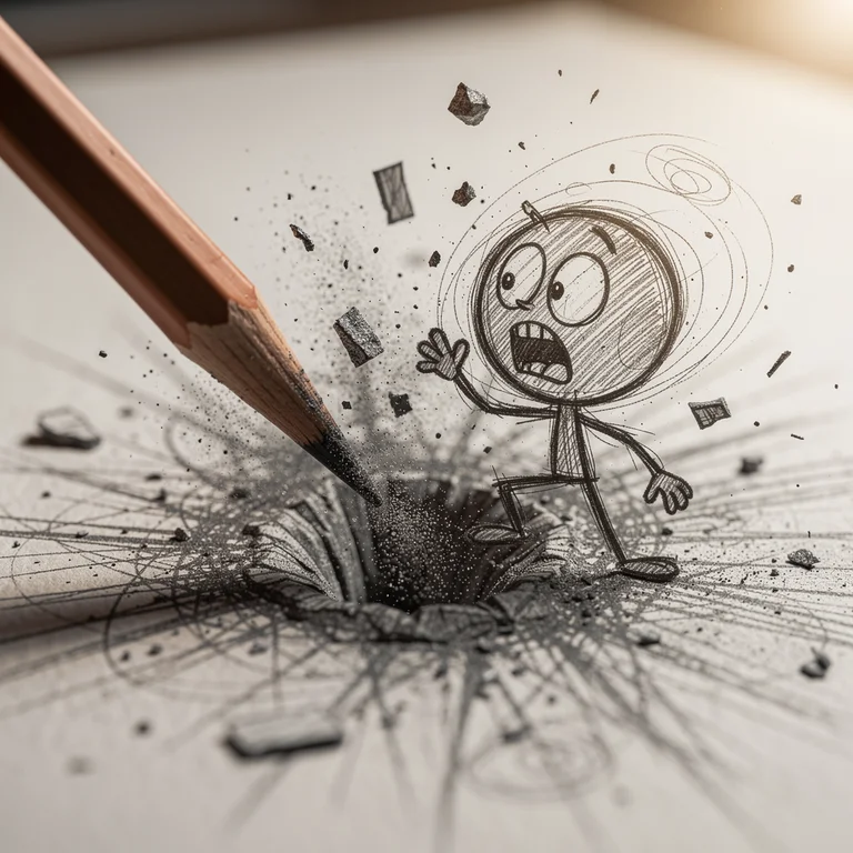 FLUX.2 Max |
FLUX.2 Dev: Concept comes through — dust cloud plus loose cartoon lines — but paper grain is suggested rather than rendered and the background bokeh is not yet creamy.
FLUX.2 Flex: Graphite particles get individual definition, paper fibers appear near the impact point, and cross-hatching strokes layer cleanly. Polished at preview resolution.
FLUX.2 Pro: Genuine particle-level motion blur, foreground fiber detail, and sketch lines with credible pen-pressure variation. DoF transitions cleanly. Editorial-ready.
FLUX.2 Max: Physically plausible particle dispersion, print-grade paper fiber, ink-on-paper stroke authenticity, and cinematically smooth bokeh. Reads as a production-quality final asset.
Image-to-Image Comparison: Two Transformation Themes
AI Compare Hub’s Image-to-Image workspace uses a single-model workflow: you select a model, upload one or more reference images, enter a transformation prompt, and generate. Testing all four FLUX.2 models on the same I2I task requires four separate runs — one per model, same references, same prompt each time.
I ran two transformation themes — the first using a single reference image, the second using multiple reference images to combine distinct subjects into one scene. The reference images are shown before each set so you can see exactly what each model is working from.
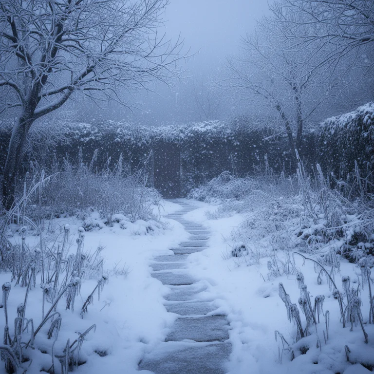
I2I Theme 1: Seasonal Winter Swap
Reference: A summer garden scene — lush green plants, flowering borders, a small house visible on the right side of the frame, warm afternoon light
Prompt: transform this summer garden scene to deep midwinter, snow-covered ground and frosted plants, bare branches glazed with ice, soft diffused overcast winter light, same garden layout and composition, cold blue-grey tones, photorealistic
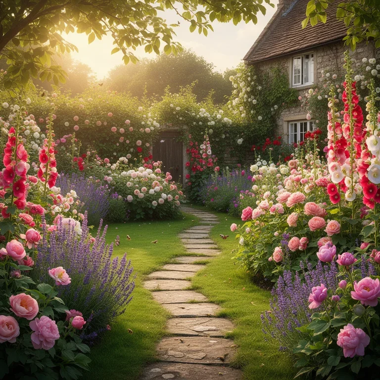
Reference image: summer garden (input)
Seasonal transformation is a precision test for image-to-image models. The model must understand the scene’s spatial structure well enough to apply winter consistently — swapping green foliage for snow, adjusting the light, aging the plant material — while keeping the garden’s original layout and every structural element from the reference intact. Structural drift from the reference, especially losing objects like the house on the right, makes the comparison less useful.
 FLUX.2 Dev |  FLUX.2 Flex |
 FLUX.2 Pro |  FLUX.2 Max |
FLUX.2 Dev: Seasonally correct snow and cold color shift, but the garden layout drifts from the reference — most visibly, the house on the right side is missing from Dev’s output entirely. Directional draft only.
FLUX.2 Flex: Bolder cold-tone shift and more dramatic snow coverage than Dev, with tighter structural correspondence to the reference. The house on the right is preserved. Flex’s contrast suits a stark winter scene.
FLUX.2 Pro: Strongest structural match of the four: plant positions preserved, the house retained, snow accumulates on the right surfaces, icicles and branch frost all present. Natural overcast light.
FLUX.2 Max: Crystalline ice on individual plants, micro-scale snow texture, correct ice-glazing on bare branches, and subtle winter-air haze. Reference fidelity is the strongest of the four outputs.
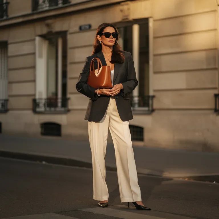
I2I Theme 2: Multi-Subject Park Composite (Multi-Image Reference)
References: Three stock product shots — image 1: a structured black blazer, image 2: black oversized sunglasses, image 3: a tan leather structured handbag.
Prompt: A cinematic high-fashion editorial photograph of a confident woman in her late twenties standing on a Parisian sidewalk in warm golden-hour light. She wears the exact structured black blazer from the first reference image, carries the exact tan leather handbag from the third reference image, and wears the exact black sunglasses from the second reference image. Pair the blazer with tailored off-white wide-leg trousers and sleek black pointed heels. Soft window reflections behind her, classical Haussmann stonework, shallow depth of field, 85mm lens look, photographed for a luxury fashion magazine. Skin tone natural, sharp details on fabric weave, leather grain, and lens frame, film-like color grading.
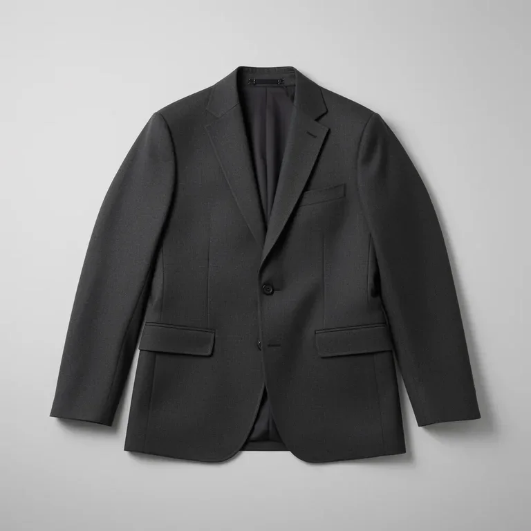 Image 1 — Black blazer (garment ref) |  Image 2 — Sunglasses (accessory ref) | 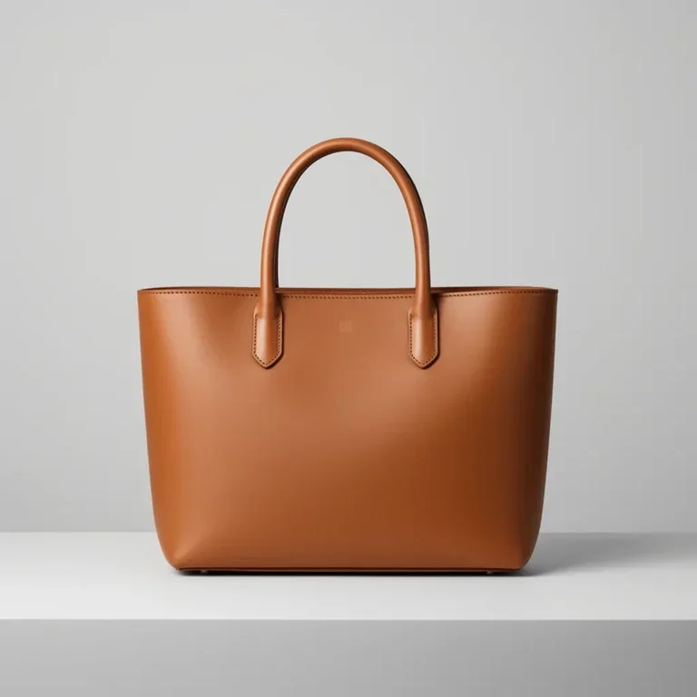 Image 3 — Handbag (accessory ref) |
Multi-image reference is where the I2I workflow really differentiates from plain T2I. The model has to pull a specific garment from one image, specific eyewear from another, and a specific handbag silhouette from a third — then dress a new subject in all three and stage her inside a full environment the prompt describes. It tests product-level fidelity across three distinct items at once, which is the core use case for fashion editorial, lookbook, and e-commerce campaign work where brand items need to render accurately on a model the art director has in mind.
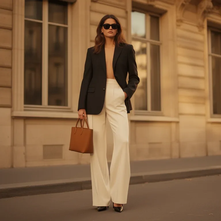 FLUX.2 Dev | 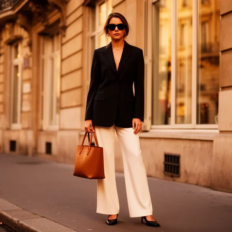 FLUX.2 Flex |
 FLUX.2 Pro | 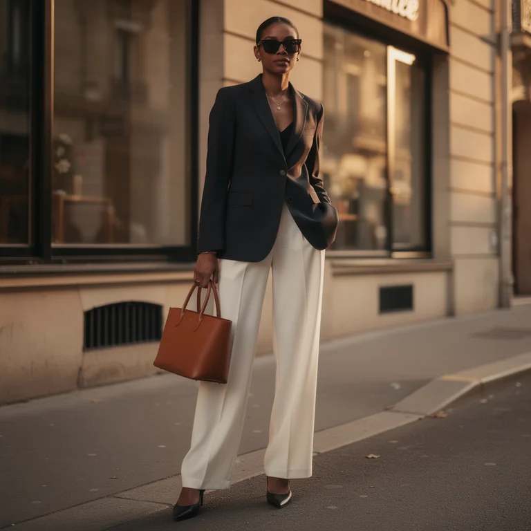 FLUX.2 Max |
FLUX.2 Dev: All three reference items are present and recognisable — black blazer, black sunglasses, tan leather tote — and the Parisian setting lands. Fidelity drifts on the styling details: the blazer is worn open with no top underneath despite the editorial brief, and the handbag is scaled down to a small tote rather than the structured silhouette in the reference. Composition and colour relationships are correct. Useful as a blocking pass or a first-look comp.
FLUX.2 Flex: Meaningful step up in cohesion. The blazer is properly closed and buttoned, with a fine gold necklace peeking through for extra editorial polish. The handbag renders larger and more sculptural with visible top handles, closer to the reference silhouette. Window reflections are richer and the Haussmann stonework reads convincingly, though a touch softer than the Pro and Max outputs.
FLUX.2 Pro: Most editorial composition of the four. Subject is framed mid-shot with the handbag held front-and-centre at waist level, turning it into the hero accessory. Blazer fit and handbag silhouette match the references closely, and a small street-address plaque anchors the Parisian setting. Directional warm light grazes the building façade; skin tone and fabric texture hold up under close inspection.
FLUX.2 Max: Delivers the strongest “photographed for a luxury magazine” look. Shallow depth of field is pronounced, with the background softly blurred into warm bokeh. Blazer, trousers, bag and sunglasses all read exactly like the reference items. Natural skin tone, sharp fabric weave, and glossy leather grain combine into a production-ready editorial image suitable for a campaign or cover crop.
Which FLUX.2 Model Should You Use?
Across eight comparison sets — six T2I themes and two I2I transformations — the differences between the four FLUX.2 models are consistent and predictable. That consistency is what makes the lineup useful as a workflow planning tool rather than just a quality ladder.
FLUX.2 Dev is the right tool for ideation, compositional validation, and early-stage exploration. It gives you usable directional output at the lowest cost in the lineup, without committing to the cost of a production run. When you’re still deciding whether a scene concept works, Dev is where to start.
FLUX.2 Flex is the choice when you want to tune the speed-versus-quality trade-off yourself. Generation parameters are exposed and adjustable, letting you run fast exploratory passes or slower high-quality generations without switching models. It also supports multi-image reference blending for composed shots, and leans well into typography-heavy and stylized content — the fireworks scene and anime kitchen both benefited from that energy. Priced above Pro, so use it where those controls matter.
FLUX.2 Pro is the reliable production workhorse. In nearly every comparison set, Pro’s output is the “last tier you’d need to go higher than” for most production use cases — editorial images, stock content, client deliverables reviewed at standard screen sizes. It represents the best quality-to-cost ratio in the lineup for sustained generative work.
FLUX.2 Max is for when the output is the final deliverable and quality is non-negotiable. The Pro-to-Max gap shows up in fine material rendering (silk weave in the haute couture shot, graphite particle physics in the pencil sketch scene), in atmospheric lighting depth (Dark Academia candlelight, the winter frost texture), in typography fidelity (the full “CAFÉ DE LA LUNE” sign with correct French accents and euro symbols). Max is the quality benchmark in the lineup. Use it when the image itself carries commercial weight.
The most efficient workflow uses all four: Dev for direction, Flex where style consistency matters, Pro for the bulk of production, and Max for the final outputs that will be seen at full resolution or used for print. Running all four on the same prompt in AI Compare Hub’s workspace makes that tiered approach easy to implement — you see exactly where the quality break points are before committing to the higher-cost generation.
Frequently Asked Questions
What is the difference between FLUX.2 Dev, Flex, Pro, and Max?
FLUX.2 Dev is the open-weights entry point designed for low-cost ideation and rapid exploration. FLUX.2 Flex exposes adjustable generation parameters so you can tune the speed-versus-quality balance yourself, and it supports multi-image reference blending for composed shots. FLUX.2 Pro is the production workhorse offering the best quality-to-cost ratio for sustained generative work. FLUX.2 Max delivers the highest fidelity for outputs where quality is non-negotiable — fine material rendering, accurate text, and print-grade results.
Which FLUX.2 model is best for commercial projects?
For most commercial work, FLUX.2 Pro offers the best balance of output quality and cost — editorial images, stock content, and client deliverables at standard screen sizes all hold up well. For outputs that carry direct commercial weight, such as print campaigns or hero images, FLUX.2 Max is the right choice. FLUX.2 Dev’s open-weights license restricts commercial use, making Pro or Max the appropriate options for paid work.
How does FLUX.2 Max compare to FLUX.2 Pro in terms of cost?
Via the Replicate API, a typical 1 megapixel (1024 × 1024 px) generation costs approximately $0.060 for FLUX.2 Pro and $0.100 for FLUX.2 Max. FLUX.2 Dev is the least expensive at $0.024 per run. The Pro-to-Max premium is worth it when fine material rendering, typographic accuracy, or print-grade detail are required — otherwise Pro covers the majority of production use cases at a lower cost.
Which FLUX.2 model handles text rendering best?
FLUX.2 Max consistently produces the most accurate text. In a Parisian café storefront test requiring French diacritics, Art Deco lettering, cursive chalkboard menus, and a vinyl door decal, FLUX.2 Max rendered all elements most legibly. FLUX.2 Pro is a strong second choice for most commercial text use cases, while FLUX.2 Dev tends to drop diacritics and produce illegible cursive.
Can FLUX.2 models work with image-to-image transformations?
Yes, all four FLUX.2 models support image-to-image generation. FLUX.2 Dev and Flex support up to 10 reference images simultaneously, while Pro and Max support up to 8. In testing, FLUX.2 Pro and Max demonstrated the strongest structural fidelity to reference images — preserving scene layout, objects, and spatial relationships while applying the requested transformation.
How can I compare FLUX.2 models side by side?
AI Compare Hub’s Text-to-Image workspace lets you run all four FLUX.2 models simultaneously on the same prompt in a single session. The results appear in a side-by-side grid so you can see quality differences before committing to the higher-cost models. The Image-to-Image workspace similarly supports multi-model testing with the same reference image and transformation prompt.
Try It Yourself
All four FLUX.2 models are available in AI Compare Hub’s Text-to-Image and Image-to-Image workspaces. You can run the same prompts I used above across all four models simultaneously to see the quality differences on your own subjects and scenes — and make a more informed decision about which model tier your workflow actually needs.